2024 Design Manifestations
I’m sure you’ve seen a few design trend alerts or predictions for 2024. Well, this is sort of that, but not really. This is article is more of a…
What I Hope to See in Web Design in 2024
Typography
Bold, chonky, personality-filled header fonts. You read that right—chonky.
I would love to see less script fonts for “accents” and more folks pushing the boundaries of even legibility (kidding) with some fun + funky fonts that do a great job infusing more personality into their online presence. I think we can leave *most script fonts in 2023. Yeah? Watch ME use a script font this year.
I also want to see some HIGH CONTRAST and folks not being too scared to go big with headlines or adding contrast in styles a bit more.
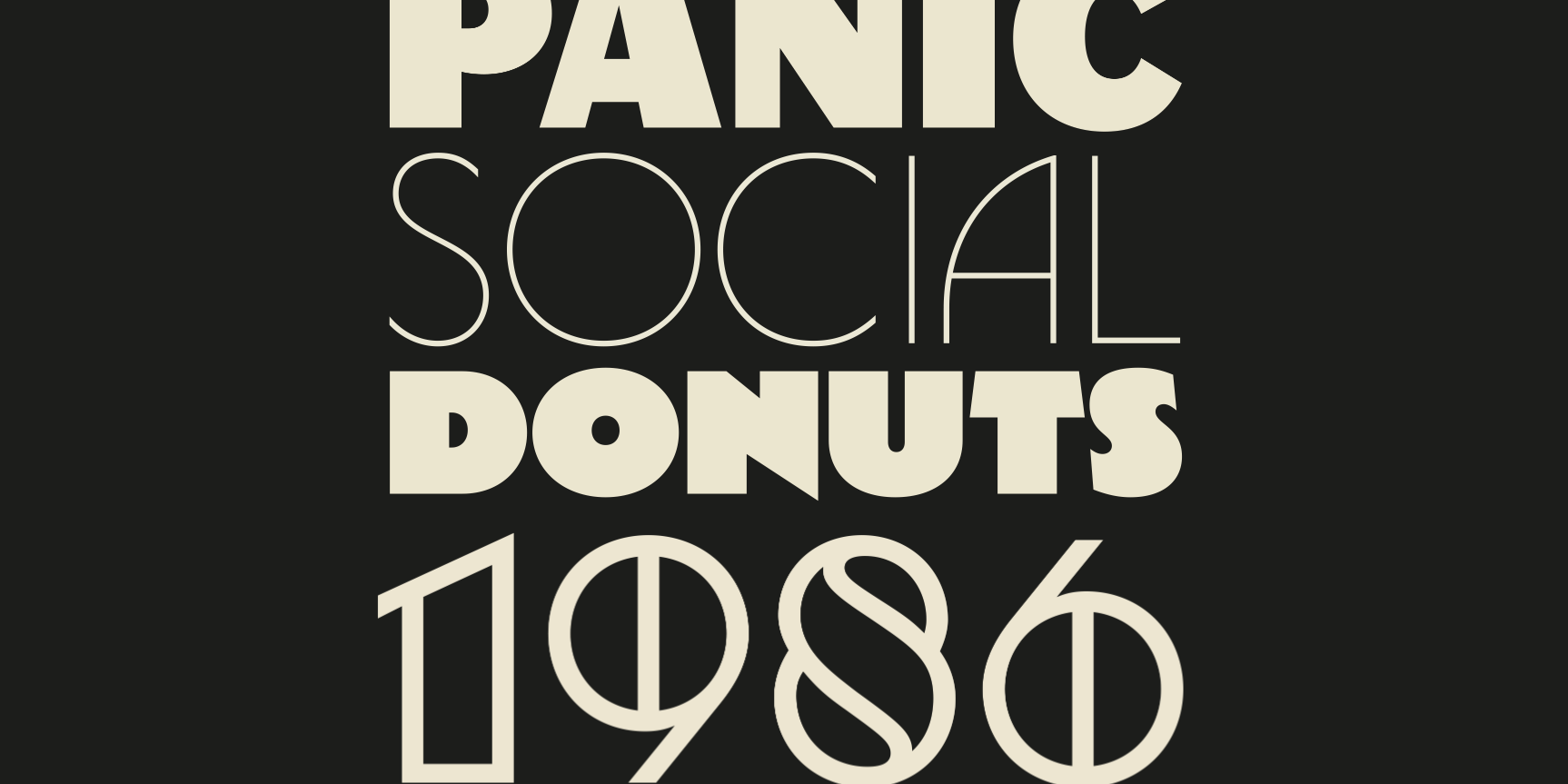
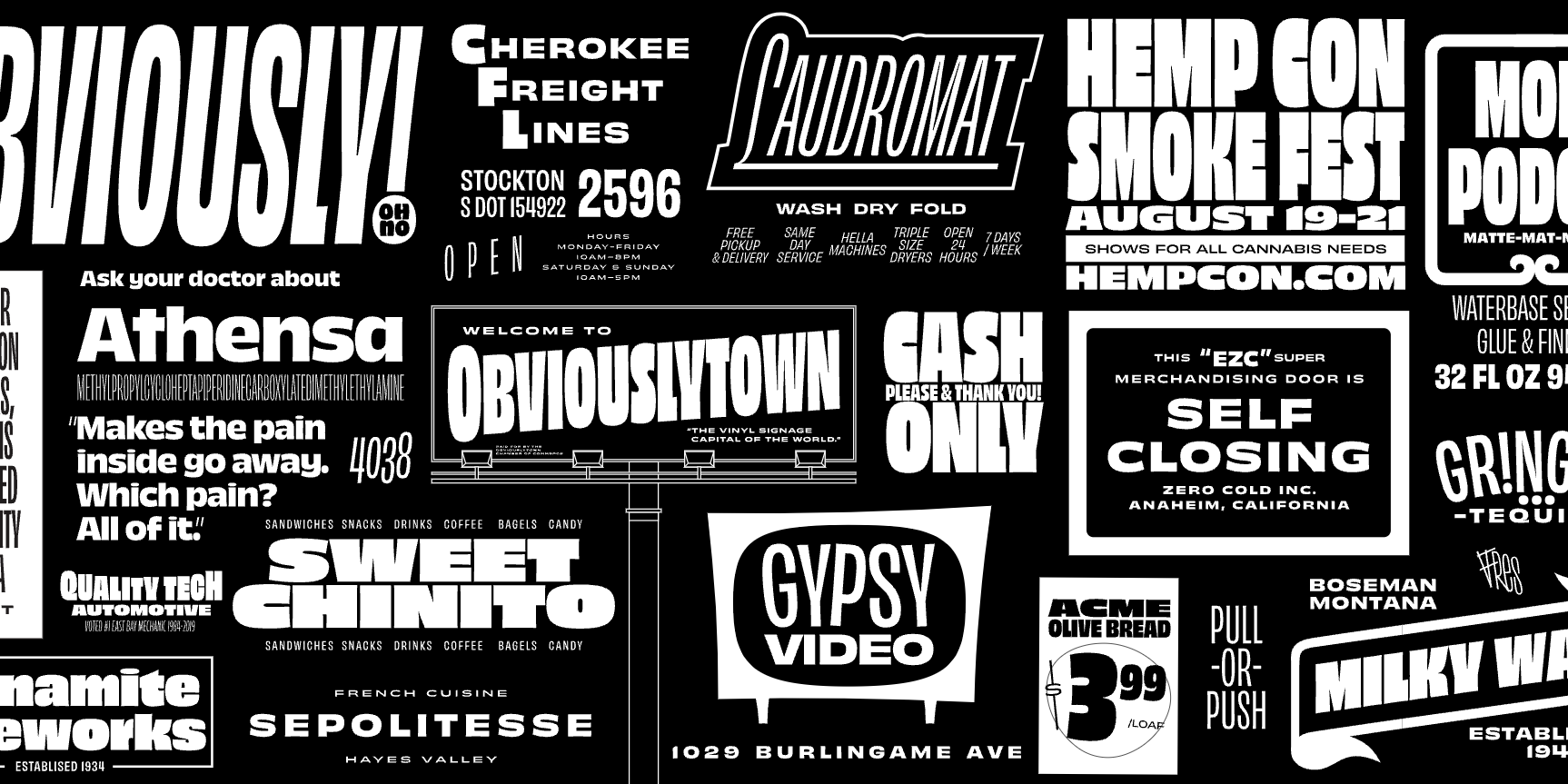
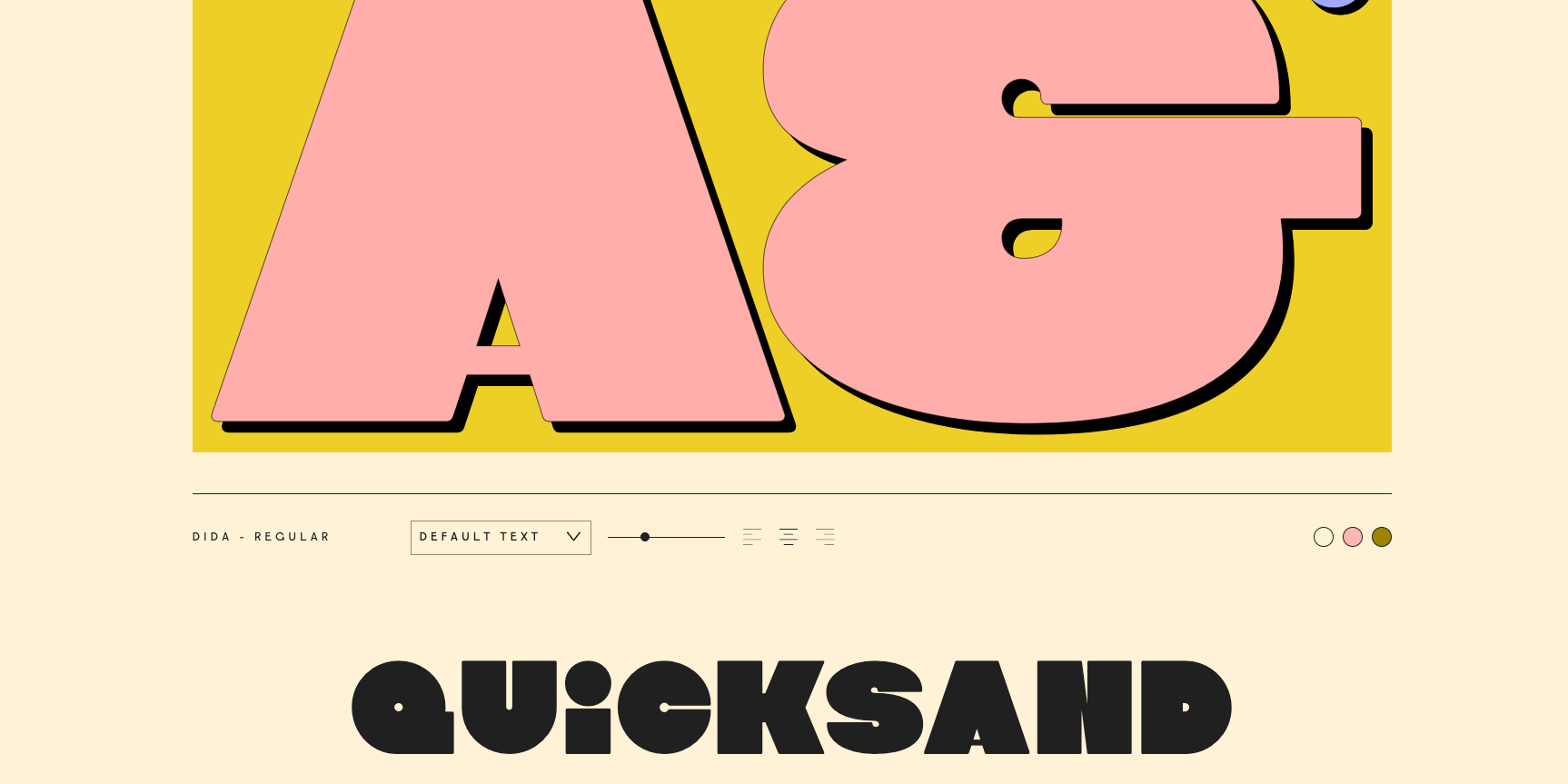
L-R, T-B: Snapshot by Kilotype / Central Type / Obviously by OH no Type Co. / Dida by VJ Type
A few of my favorite type foundries to find those personality packed display header fonts are: Future Fonts / Hoodzpah / House Fonts / Brandon Nickerson
Web Animations
Micro interactions and hidden gems
I absolutely love a treasure hunt on a website. Not a literal one but one where you feel pure delight when you hover over a button the first time and it does something so unexpected and glorius. I think big crazy site-wide animations are on their way out. Which from a user perspective is probably desirable. There is nothing more frustrating that waiting for a site to get done showing off—am I right?
But, with big, flashy site-wide animations out the door, I hope we’ll be seeing some really unique, thoughtful animations and interactions that bring joy. Even if it’s just a little.
Color
Less beige. More color. More contrast.
Now, if you haven’t picked up on it already—I’m kind of a maximalist when it comes to design. I like big, bright, bold, expressive. But I get that that’s not everyone’s bag. But I do hope that we start seeing more expressive pops of color and less beige tonal color palettes. I’m hoping to see some funky, unexpected color palettes with higher contrast and intrigue.
My friend KL from Mushaboom Studio and I have a saying — black and white, but colorful. I’ve started seeing some websites and print design that has been simple in layout but goes bold with swapping a staple black text on white background for red text on a cream background or a bright neon on a dark background. The design is still minimal and simple—but packs a bigger punch.

Image from Unsplash / Body Copy: Area on Adobe Fonts / Header: Megazoid on Adobe Fonts
Content
Less is more.
I’m having a chuckle at myself for this one. I’m really a more is more kinda gal when it comes to design. But I think we’re all just tired being in the online space being indoctrinated by every service provider with long-form website sales pages. It feels, I don’t know—like too much work? I’m probably going to have the copywriters come at me for saying this but I think folks want to get to the point?! I do. I think the cool part about this is seeing folks get more creative with how they can be precise, succinct, and impactful.
Adding Emphasis in Your Copy
More creativity.
First of all—let’s not go ham with fancy text highlights but….I hope the days of seeing a chunk of text with ALL CAPS STATEMENT HERE. Mixed with something that’s italic. Then bold and throw in an emoji 🤩 are out. I get that sometimes we gotta use what we’ve got to make an impact but I think we can get more creative.
Squarespace added a feature called text highlights. This is a sweet tool to have at your fingertips where you can pick from 12 different highlight styles and make any color you like. I love accessible features like this to add interest and intrigue in a new way. See what I did there :)
Freak Flags Flyin’
More you.
I absolutely love that we are seeing the way folks do business change so much. A huge part of this is people being themselves and making their own rules. We can get very easily get sucked into the “what’s been done” path if subconsciously. With the “every brand is a personal brand” movement—that leaves a lot of room to carve our own paths and build businesses and brands truly unique to us. And what have all the gurus have been telling us all along?! What’s your secret sauce? People want to work with Y.O.U. Leverage your unique set of skills.
That’s all I got! We’ll just have to check back here in 12 months to see if I did in fact manifest anything or not. Cheers to a new year, folks.